

Welcome to a collection of my original photographs and travel montages!
My background in fashion design & Illustration and love of the creative sparked a freelance career as a photographic stylist.
For over 20 years I have worked across an array of print, television and digital mediums in the commercial, advertising and editorial industries. Having the opportunity to work with leading Australian photographers fuelled my love of design and photography.
I moved to Hong Kong in 2007 with my family and from the moment we arrived I made sure to take advantage of being a resident of the fabulous city. I have spent thousands of hours traversing the streets; digging beneath the surface in Hong Kong never fails to delight.
Hong Kong’s geographical position allowed ease of travel throughout the rest of Asia, Europe, North Africa and the Indian subcontinent which has enabled me to create a range of city-specific travel montages.
I spend many hours working on the compositions of my montage layouts in order to share the simple and sometimes hidden beauty, rich colour and diverse culture in the world around us.
Enjoy your travels through my website; if you have any questions, drop me an email.
Belinda
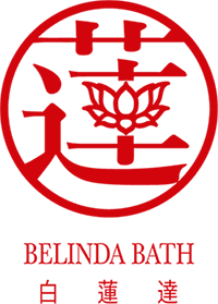
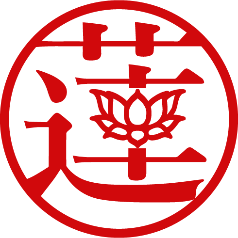
In my new logo, the second Chinese character (蓮) meaning lotus flower, evokes artistic conception, and is the most meaningful among the three characters that make up my name. To emphasise the beauty of this character, the middle stroke was replaced with a figurative lotus.
In the classical literature of many Asian cultures the lotus is present in figurative form, representing elegance, beauty, perfection, purity and grace, and is often used in poetry and song as an allegory for ideal feminine attributes. The character is encircled like the simple geometric shapes found on traditional hand-carved Chinese name chops.
The first character means white, the second means lotus, and the third is understood to imply wisdom whilst soundly rounding off the English counterpart and verbal speak for ‘dar’.
The choice of typeface for the brand mark, 游明朝体+36ポかな , belongs to the Ming family, and possesses variable line weight and characteristic decorations comparable to Western serif typefaces.
The overall geometric regularity of the type is well balanced and conveys a positive zen-like feel.